data visualization | Mar 27, 2024
A Comprehensive Guide to Visualization Tools, Examples, and Interactive Insights
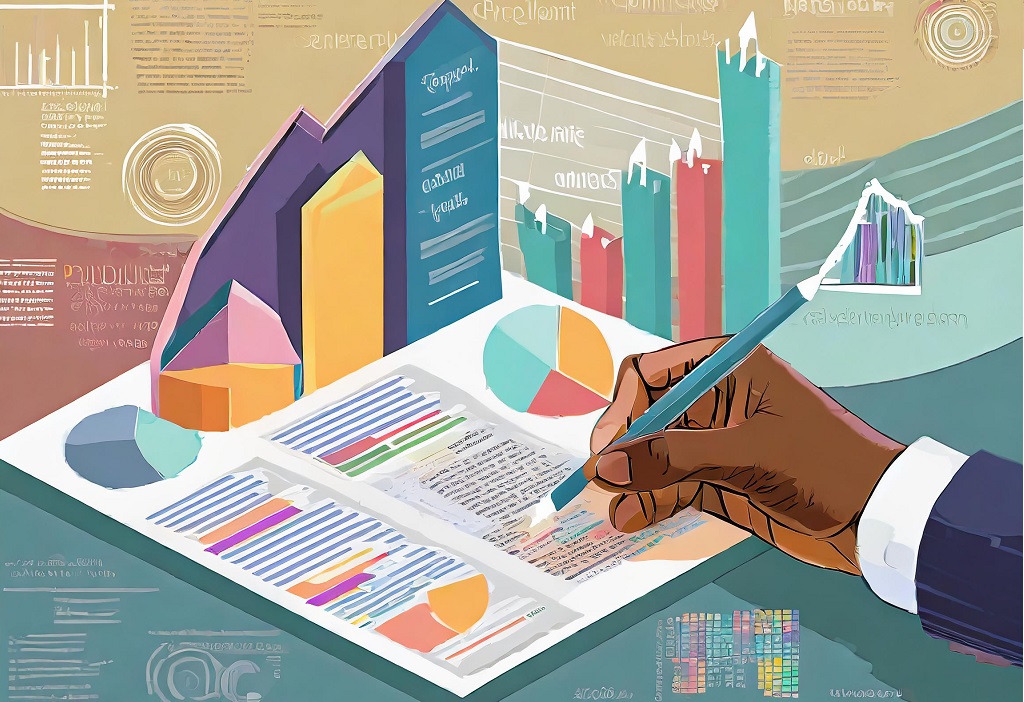
What is Data Visualization?
Data visualization is the graphical representation of data to uncover patterns, trends, and insights. It transforms complex datasets into easily understandable visuals, providing a powerful means of conveying information, facilitating decision-making, and telling compelling stories.
Why is Data Visualization Important?
- Enhances Understanding: Visual representations simplify complex data, making it easier for individuals to comprehend patterns and trends.
- Facilitates Decision-Making: Visualizations provide a clear and concise way to present data, aiding in more informed and effective decision-making processes.
- Identifies Patterns and Trends: Visualization tools enable the identification of patterns and trends that may not be apparent in raw data, fostering deeper insights.
- Engages Stakeholders: Compelling visuals engage audiences, fostering better communication and understanding among stakeholders.
Core Principles of Effective Data Visualization
Effective data visualization adheres to core principles to ensure clarity and impact:
- Simplicity: Keep visualizations simple to avoid overwhelming the audience with unnecessary details.
- Relevance: Focus on displaying data that directly contributes to the intended message or insight.
- Accuracy: Ensure accuracy in data representation to maintain credibility and trust.
- Consistency: Use consistent colors, scales, and labels across visualizations for easier interpretation.
- Interactivity: Incorporate interactivity where appropriate to enhance user engagement and exploration.
Data Visualization Tools
The best way is to explore different options and find the best data visualization tool for your data.
General Tools:
- Power BI: Microsoft's business analytics tool that enables users to visualize and share insights across an organization.
- Tableau: A leading data visualization platform known for its versatility, allowing users to create interactive and shareable dashboards.
- Google Data Studio: A free tool for creating interactive reports and dashboards, seamlessly integrating with other Google services.
- Qlik Sense: Empowers users to explore and visualize data intuitively, making data discovery and analysis accessible.
Specialized Tools:
- D3.js: A JavaScript library for producing dynamic, interactive data visualizations in web browsers.
- Infogram: Specializes in creating infographics and interactive charts for visually engaging presentations.
- Datawrapper: Focuses on creating clear and compelling visualizations, offering simplicity and customization.
- Highcharts: A JavaScript charting library widely used for creating interactive and dynamic visualizations.
- Chartist.js: A lightweight and responsive JavaScript library for creating simple yet elegant charts.
No-Code Options:
- Zoho Analytics: Allows users to create reports and dashboards without coding, catering to a wide range of analytical needs.
- Ottava: A no-code platform that empowers users to visualize and interact with their multi-dimensional data for better decision-making.
- Domo: Provides insights to streamline analytics and supports informed decision-making, contributing to improved business performance and growth.
- Looker: A data exploration and business intelligence tool that simplifies the process of creating and sharing insights.
Read more on Unveiling the Power of Data Visualization Software, Tools, and Platforms
Data Visualization Examples
Visualizing data can take various types of graphs and charts, including:
- Line Charts: Display trends over time.
- Bar Charts: Compare data across categories.
- Pie Charts: Illustrate proportions of a whole.
- Heatmaps: Visualize data density.
- Bubble Charts: Depict relationships between three variables.
- Geospatial Maps: Display data on a map for geographical insights.
Visualizing data involves selecting the right types of charts to effectively communicate specific patterns or insights. Here are examples of data types best suited for various chart types:
Line Charts:
- Best for: Showing trends and patterns over time.
- Example: Displaying the stock prices of a company over several months to identify market trends.
Bar Charts:
- Best for: Comparing values across categories.
- Example: Comparing sales performance across different product categories for a given time period.
Pie Charts:
- Best for: Illustrating proportions of a whole.
- Example: Representing the percentage distribution of budget allocation across various departments.
Heatmaps:
- Best for: Visualizing data density and variations.
- Example: Showing website user activity with color intensity indicating the frequency of clicks on different webpage sections.
Bubble Charts:
- Best for: Depicting relationships between three variables.
- Example: Visualizing data that includes three dimensions, such as comparing countries based on population (size of bubble), GDP (x-axis), and life expectancy (y-axis).
Geospatial Maps:
- Best for: Displaying data on a map for geographical insights.
- Example: Illustrating global sales performance with different colors indicating revenue levels in various regions.
Understanding your data and selecting the appropriate charts can provide valuable insights to your audience. Here are some compelling examples:
Netflix's "Trending Now" Feature:
Netflix's "Trending Now" feature showcased the importance of selecting the right visualization for user experience. By incorporating scatter plots and interactive heatmaps, Netflix not only personalized content recommendations but also enhanced user engagement, underscoring the significance of choosing charts that align with the data at hand.
Johns Hopkins University's COVID-19 Dashboard:
The COVID-19 dashboard developed by Johns Hopkins University showcased the power of heatmaps in representing real-time data on the global spread of the virus. This visualization example demonstrated how heatmaps can effectively communicate the severity of outbreaks in different regions, aiding in decision-making during a global health crisis.
These examples underscore the importance of thoughtful data visualization in conveying complex information clearly and engagingly to diverse audiences.
Read more on Mastering Data Visualization - Choosing the Right Graphs for Impactful Insights
Interactive Visualization and Data Exploration
Interactive data visualization enhances the user experience by allowing exploration and manipulation of data:
- Filtering and Drill-Downs: Users can focus on specific data points by applying filters or drilling down into details.
- Hover-over Insights: Interactive tooltips provide additional information when users hover over data points.
- Dashboard Interactivity: Dashboards with clickable elements and linked visuals enable a seamless exploration experience.
- Real-time Updates: Some tools offer real-time data updates, keeping visualizations current and relevant.
Interactive visualization not only aids in better understanding data but also facilitates a dynamic and engaging storytelling process.
Incorporating data visualizer into your workflow empowers you to unearth actionable insights, communicate complex information effectively, and make data-driven decisions with confidence.
Common Data Visualization Mistakes
Avoiding these common mistakes enhances the effectiveness of data visualizations:
- Overcomplication: Avoid overcrowded visuals that can confuse rather than clarify.
- Misleading Representations: Ensure visualizations accurately represent the data, avoiding distortions or misinterpretations.
- Ignoring Audience Needs: Tailor visualizations to the specific needs and preferences of the intended audience.
- Lack of Context: Provide context to data points to aid understanding and interpretation.
- Not Iterating: Regularly review and refine visualizations based on feedback and changing requirements.
Incorporating these principles and avoiding common mistakes maximizes the impact of data visualization, ensuring that insights are effectively communicated and understood by diverse audiences.
Data Visualization Trends
As technology continues to advance, data visualization undergoes transformative trends that shape the way we interact with and derive insights from data:
- Augmented and Virtual Reality (AR/VR): The integration of AR and VR technologies is elevating data visualization to immersive experiences, allowing users to engage with data in three-dimensional spaces.
- AI and Machine Learning Integration: The use of AI and machine learning in data visualization software enables automatic insights generation, predictive analytics, and enhanced recommendations, providing a more intelligent approach to data analysis.
- Storytelling with Data: The emphasis on storytelling as an integral part of data visualization is growing. Beyond presenting data, effective storytelling enhances understanding and engagement, making insights more impactful and memorable.
- Advanced Interactivity: With an increased focus on user experience, data visualization tools are incorporating more sophisticated interactive features, enabling users to manipulate, explore, and personalize visualizations to suit their specific needs.
- Explainable AI in Visualizations: As AI algorithms become more prevalent, the demand for transparent and interpretable AI-driven visualizations is on the rise. Users want to understand how AI-derived insights are generated, fostering trust and usability.
- Data Ethics and Privacy: With the growing concern for data privacy, ethical considerations in data visualization are gaining prominence. Ensuring responsible and secure use of data is becoming an integral aspect of the design and implementation of visualizations.
These trends collectively contribute to an evolving landscape where data visualization becomes not only more powerful and insightful but also more accessible and user-centric. Staying abreast of these trends empowers organizations to harness the full potential of data visualization in an ever-changing technological environment.
Read more on Insightful Imagery: The Transformative Trends in Data Visualization
Data visualization plays a crucial role in uncovering hidden insights that empower us to make informed decisions. It is not just about presenting data; it's about transforming raw information into actionable knowledge. By leveraging the right tools, drawing inspiration from successful examples, and selecting appropriate chart types and graphs, we embark on a journey of data exploration that leads to valuable discoveries. Moreover, being mindful of common pitfalls ensures that our visualizations are accurate, clear, and impactful. As we embrace the power of data visualization, we unlock the potential to drive innovation, solve complex problems, and drive positive change in our organizations and communities.