data visualization | Mar 20, 2024
Maximizing Insights: The Advantages of Building Interactivity into Data Visualizations

In the realm of visual analytics, interactive data visualization stands as a pivotal tool, offering a dynamic means to explore, analyze, and derive insights from complex datasets. At the core of this approach lies the concept of interactivity, which plays a crucial role in unlocking the full potential of visualizations. Let's delve into the advantages of integrating interactivity into visual analytics and how it enhances the exploration and understanding of data.
Building interactivity into visualizations offers several advantages:
Enhanced Engagement: Interactive visualizations can captivate users by allowing them to explore data dynamically. Users are more likely to engage with and understand the data when they can interact with it directly, leading to a deeper level of engagement.
Customization: Interactivity enables users to customize their visualizations according to their preferences or specific needs. They can adjust parameters, filter data, or choose different views, empowering them to derive insights tailored to their interests.
Deeper Insights: Interactive elements allow users to drill down into the data, uncovering patterns, trends, and relationships that might not be immediately apparent in static visualizations. By manipulating the visualization in real-time, users can gain a deeper understanding of the underlying data.
Facilitates Exploration: Interactivity encourages exploration and experimentation. Users can dynamically change variables, zoom in on specific areas of interest, or switch between different visual representations, fostering a more exploratory approach to data analysis.
Improved Communication: Interactive visualizations facilitate better communication of complex information. Users can interact with the data in real-time during presentations or discussions, allowing for more effective communication of insights and findings.
Iterative Analysis: Interactivity supports an iterative approach to data analysis. Users can make adjustments on the fly, instantly seeing the impact of their changes and refining their analysis iteratively until they achieve the desired results.
User Empowerment: By providing interactive features, visualizations empower users to become active participants in the data analysis process. Users can manipulate the visualization to answer their own questions or test hypotheses, promoting a sense of ownership and control over the analysis.
Responsive to User Needs: Interactivity allows visualizations to adapt to the preferences and requirements of individual users or different user groups. This flexibility ensures that the visualization remains relevant and useful across diverse contexts and user scenarios.
Overall, integrating interactivity into visualizations can significantly enhance their effectiveness as analytical tools, communication aids, and decision-making resources.
Harnessing the Power of Interactive Visualization
- Zooming and panning for detailed examination
- Tooltips offering contextual information
- Filtering options for customized views
- Dynamic data updates for real-time analysis
Combining these noteworthy features in interactive visualizations not only enhances user experience but also maximizes the utility of the tool for data exploration, analysis, and decision-making. By enabling detailed examination, providing contextual information, offering customization options, and ensuring real-time updates, interactive visualizations empower users to extract valuable insights from complex datasets efficiently and effectively.
Familiarize yourself with popular and innovative visualization toolkits and libraries such as D3.js, Plotly, Ottava, Matplotlib, ggplot2, etc.
- D3.js empowers developers to create captivating interactive visualizations by seamlessly combining data with HTML, SVG, and CSS for dynamic user engagement. A JavaScript library for creating dynamic, interactive visualizations in web browsers, offering unparalleled control and flexibility for data-driven graphics.
- Plotly offers dynamic, user-friendly visualization tools, enabling interactive exploration of data through customizable charts, graphs, and dashboards, enhancing data comprehension and analysis.
- Ottava's interactive visualization offers immersive exploration, empowering users to dynamically engage with data, fostering deeper understanding through customizable, intuitive interfaces.
- Matplotlib also offers limited interactivity, making it suitable for basic exploration and simple interactive visualizations in Python. Predominantly known for static plotting
- ggplot2 in R enables users to produce interactive visualizations with publication-quality aesthetics and intuitive syntax for data representation and exploration.
These tools provide a wide range of functionalities for creating interactive visualizations across different data visualization platforms and programming languages.
Read more on Unveiling the Power of Data Visualization Software, Tools, and Platforms
Example of Interactive Data Visualization: Global Temperature Map
The interactive global temperature map displays Earth's surface divided into regions, allowing users to overlay temperature data layers such as average annual temperature or anomalies. A time slider enables users to observe changes over time, with a color gradient representing temperature values from cooler (blue) to warmer (red). Users can click on locations for detailed temperature information and customize parameters like color schemes and opacity.
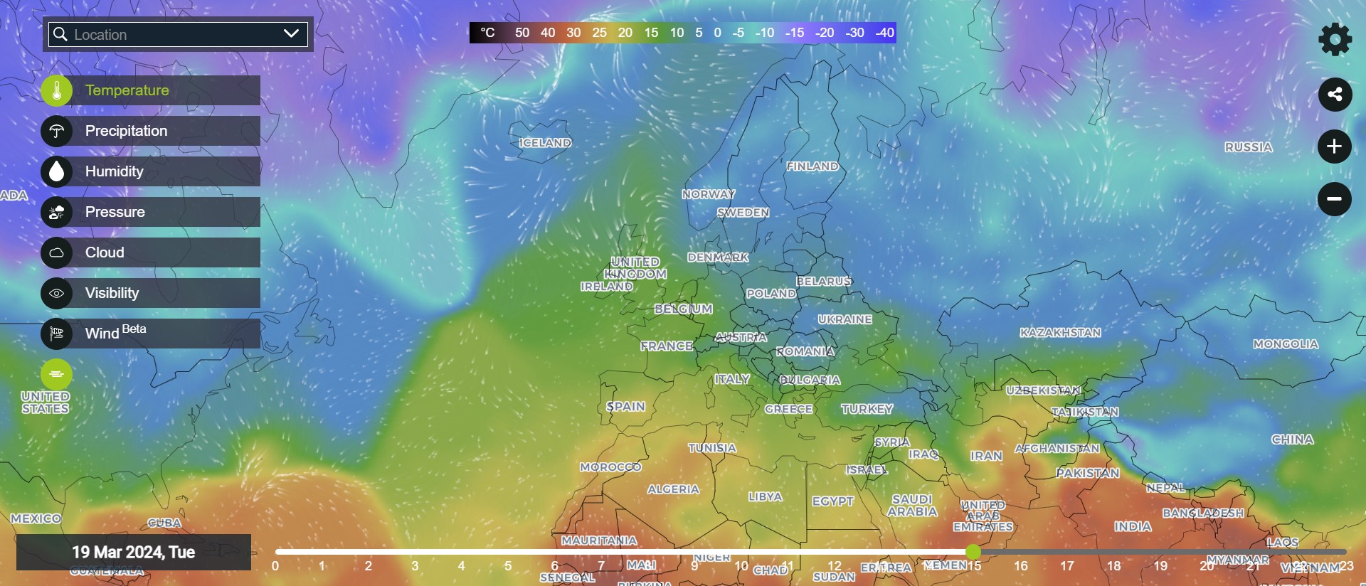
(source: https://map.worldweatheronline.com/temperature)
Zoom and pan functions allow users to explore temperature variations at different scales, while filtering options refine data by region, time period, or temperature type. Comparative analysis is facilitated by overlaying multiple data layers or viewing side-by-side visualizations.
The visualization aids research, helping climate scientists analyze long-term temperature trends and identify regions undergoing significant changes. In education, it serves as an educational tool to explain climate change concepts. In policy-making, officials rely on it to make informed decisions regarding climate mitigation and adaptation strategies, identifying regions vulnerable to temperature extremes.
Read more on Mastering Data Visualization - Choosing the Right Graphs for Impactful Insights
Conclusion
Integrating interactivity into data visualizations revolutionizes the exploration of complex datasets. Features like customization options and real-time updates enhance engagement, deepening insights and empowering users to interact dynamically with data. This iterative approach fosters a nuanced understanding, refining analysis until desired results are achieved. Flexible visualizations ensure relevance across diverse contexts, catering to individual preferences. From aiding research to informing policy decisions, interactive visualizations have broad implications. By harnessing interactivity, visualizations become powerful analytical and communication tools, maximizing effectiveness in extracting insights and transforming data interaction.