stories | Feb 26, 2024
Unlocking Insights Directly from Multi-dimensional Reports

Have you ever come across a compelling report filled with fascinating statistics and comparisons, only to find yourself limited in fully understanding the complete narrative? You're not alone. Many users encounter this common challenge: restricted access to raw data prevents deeper exploration and discovery. Traditional data analysis tools face limitations, necessitating additional steps to unravel the "why" behind the presented numbers.
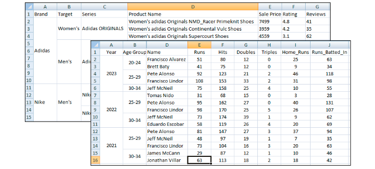
Consider this scenario: you're a marketing manager examining a comparison of your brand against competitors on a popular review site. While the report reveals promising trends, you desire a more in-depth analysis. The aspiration is to study specific demographics, explore nuances in sentiment, or identify the key drivers behind positive or negative feedback. You lack access to the original data; the report arrives in a pivoted multi-dimensional snapshot, leaving you uncertain about how to proceed with further analysis or visualization to explore it comprehensively.
Tools such as Tableau and Excel are powerful but demonstrate limitations when confronted with pivoted reports. Tableau struggles with complex multi-layered structures, requiring tedious data manipulation before showcasing its visual prowess. Excel, although versatile, can only present static charts, confining you to a two-dimensional landscape. Further pivoting? Forget it – you'll need to convert the data into a raw, tabular format first, adding frustration to your quest for insight.
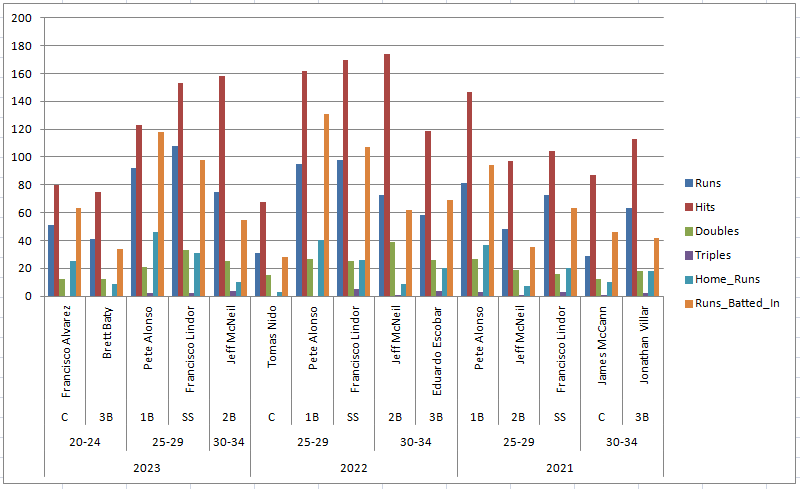
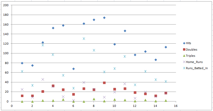
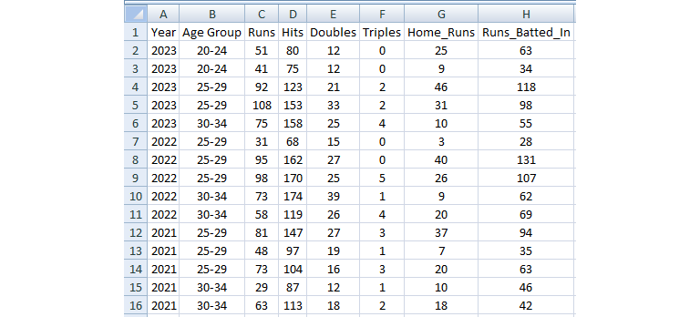
Take the NY Mets Batting example above; here are two recommended charts by Excel: the first chart contains everything, but it is too much and hard to tell what is essential from the chart. The second chart does not really make sense in this context.
At Ottava, we take a different approach. We convert your multi-dimensional (aka cross-tabulation) data to structured, tabular data in the back for you. The magic is complicated, but simply put, it is done using the following steps:
- Identify the number area
- Identify the label area
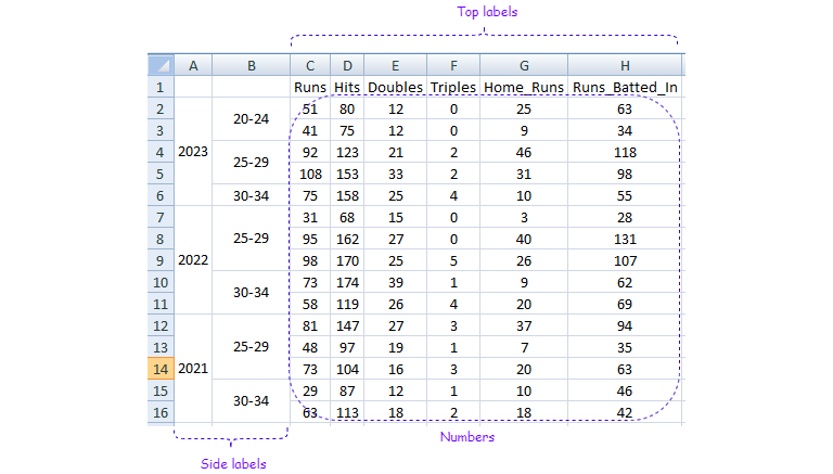
- Construct trees for the corresponding labels
- Transverse the tree into the final structured tabular data
Read more on Decoding Data Analysis: Transforming Cross-Tabulation into Structured Tabular Tables
The whole process happens inside Ottava’s engine -your multi-dimensional report is now tabular data in Ottava and can be sliced and diced easily.
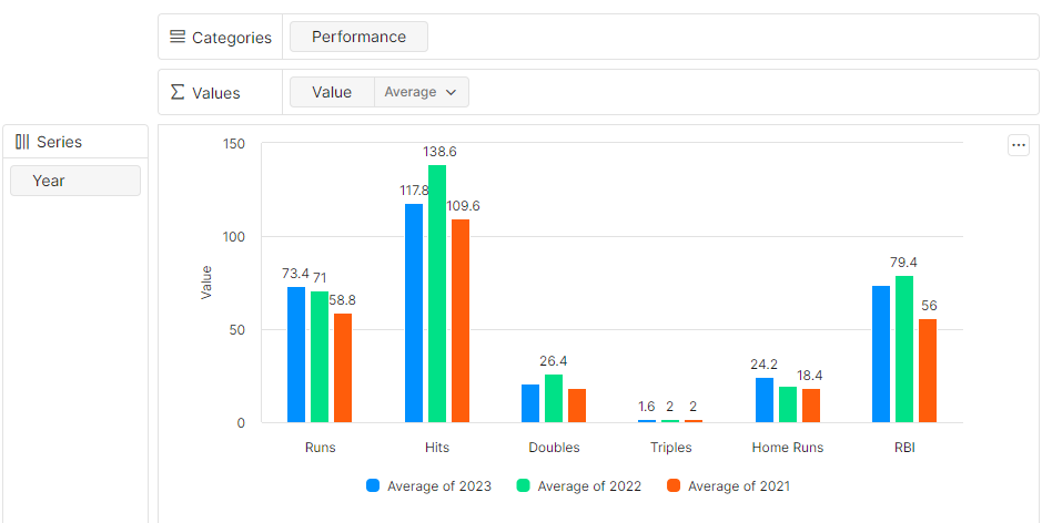
Here’s a sample recommended chart by Ottava where we can easily compare the performance of each action by year:
Ottava facilitates moving beyond the surface, peeling back the layers of pre-digested information to reveal the rich stories within. It's about unleashing the full potential of data, irrespective of its format, and placing the power of insight into the hands of everyone.
The next time you encounter a captivating report, embrace the capabilities of Ottava and dive into the data-driven narrative waiting to be unveiled.